

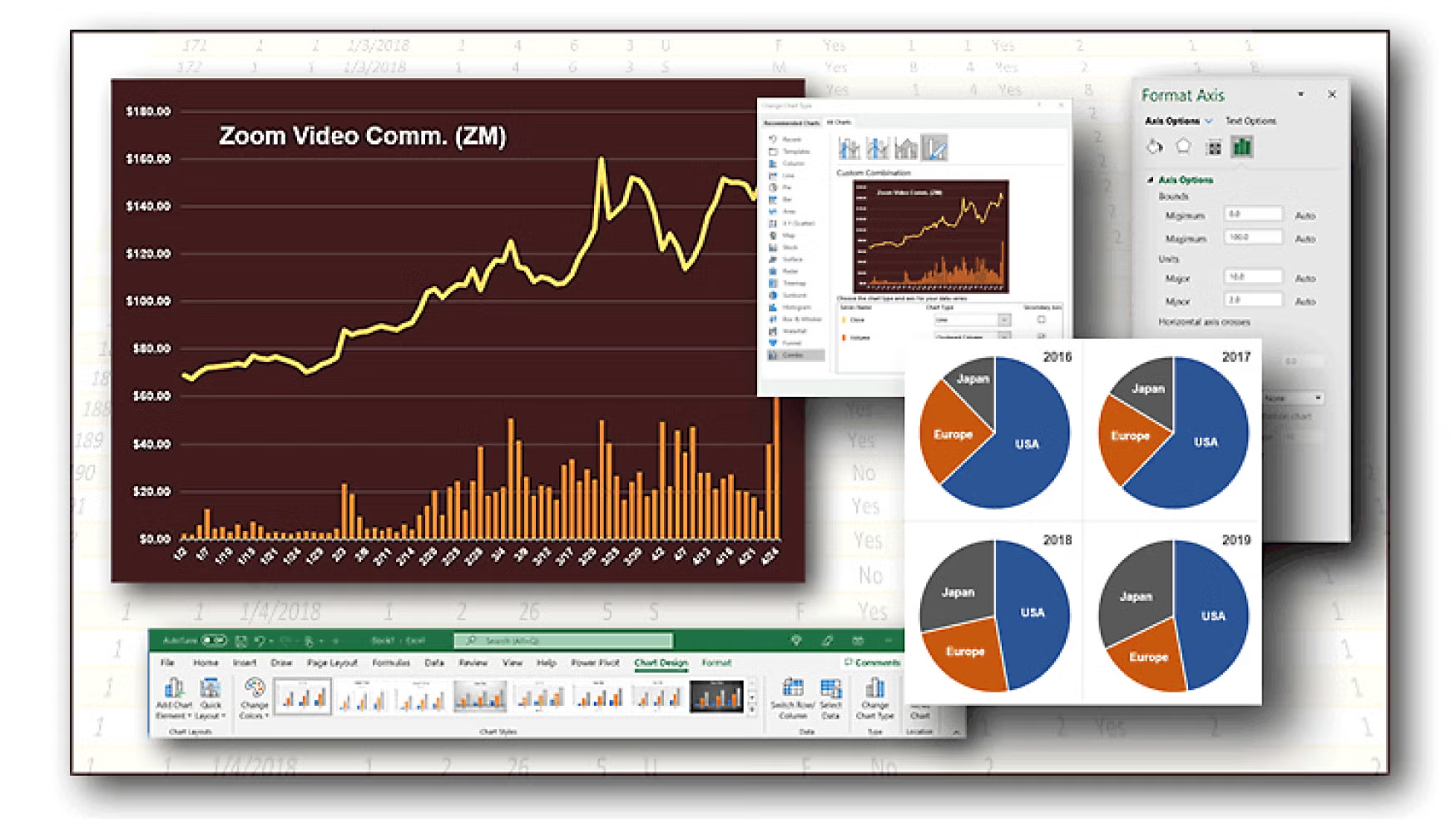
They say a picture is worth a thousand words. That’s especially true today as our ability to gather information far outpaces our ability to absorb it. Excel charts provide a powerful and easy to use tool for visualizing complex data.
This live program will explain and demonstrate how to:
- Choose the type of chart best suited to your data and analysis;
- Organize your data to facilitate charting;
- Build a simple chart in one click;
- Preview different chart types to see which works best for you;
- Move and size a chart;
- Designate which data to plot on horizontal and vertical axes;
- Add, remove, and format chart elements, such as titles, axis and data labels, tick marks and grid lines;
- Choose custom fonts and colors for chart elements, customize axis scale and intervals, and reposition and resize chart elements;
- Use graphics to build various chart elements, for example stacked oil drums in a column chart to represent quantities of production or consumption;
- Connect multiple charts to the same data so they update together; and
- Combine several chart types, for example column and line charts, in the same plot area (sometimes called an overlay chart).
Location Information
Sponsors & Partners